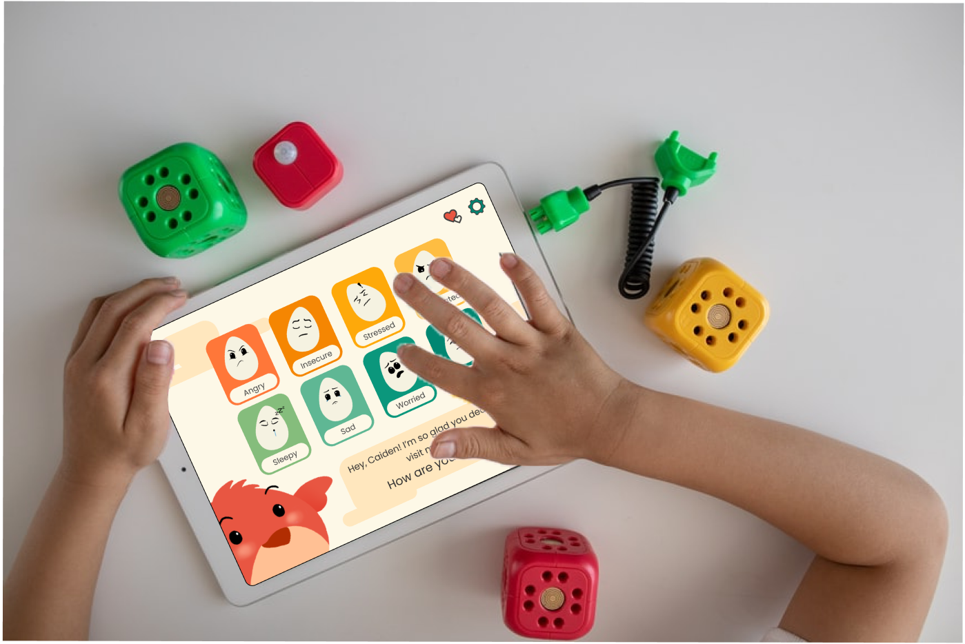
Wren is a mobile app concept designed to help children ages 6–10 learn emotional regulation through reflection, visualization, and parent-guided activities. The goal was to give families a positive way to navigate tough emotions—encouraging kids to identify what they feel, understand why, and explore healthy coping strategies.
This project was my capstone for UX Design bootcamp. While it wasn’t created for a real company, I treated it like a live product—conducting real user research, defining goals, designing iteratively, and validating my ideas through usability testing with parents and children.
Designing for children required balancing engagement and simplicity while maintaining emotional sensitivity and accessibility. The challenge was to build an experience that was visually intuitive for kids, informative for parents, and calming for both.
With no pre-existing data or users, I had to create the entire foundation (research plans, survey instruments, personas, and usability protocol) from scratch.
I worked independently over eight weeks, completing every stage of the UX process: research, synthesis, wireframing, visual design, prototyping, and usability testing. This work was informed by my prior experience as a behavioral therapist supporting emotional learning for autistic children. Mentors provided critique checkpoints, but every decision was driven by my own research and validation.
Wren demonstrated my ability to take an abstract problem (emotional regulation) and translate it into a tangible, testable digital solution. The process strengthened my confidence in mixed-methods research, accessibility-first design, and aligning tone and visuals to emotional goals.
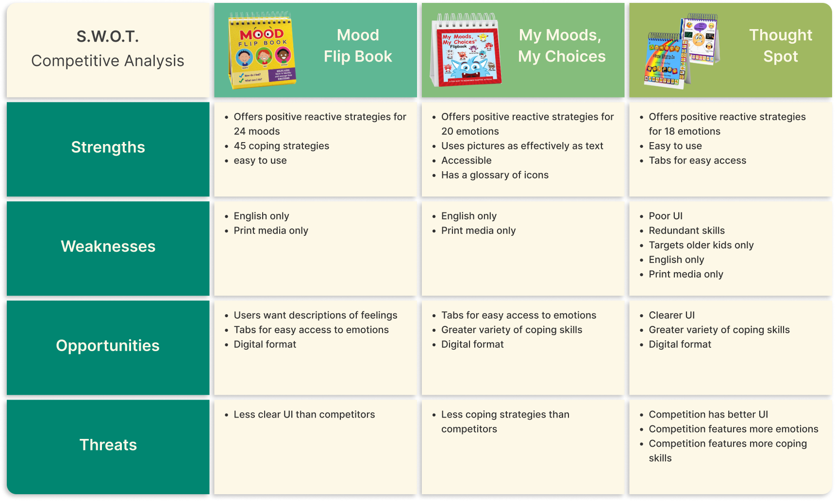
Using the SWOT method, I analyzed the strengths, weaknesses, opportunities, and threats of three products; Mood Flip Book; My Moods, My Choices; and Thought Spot.
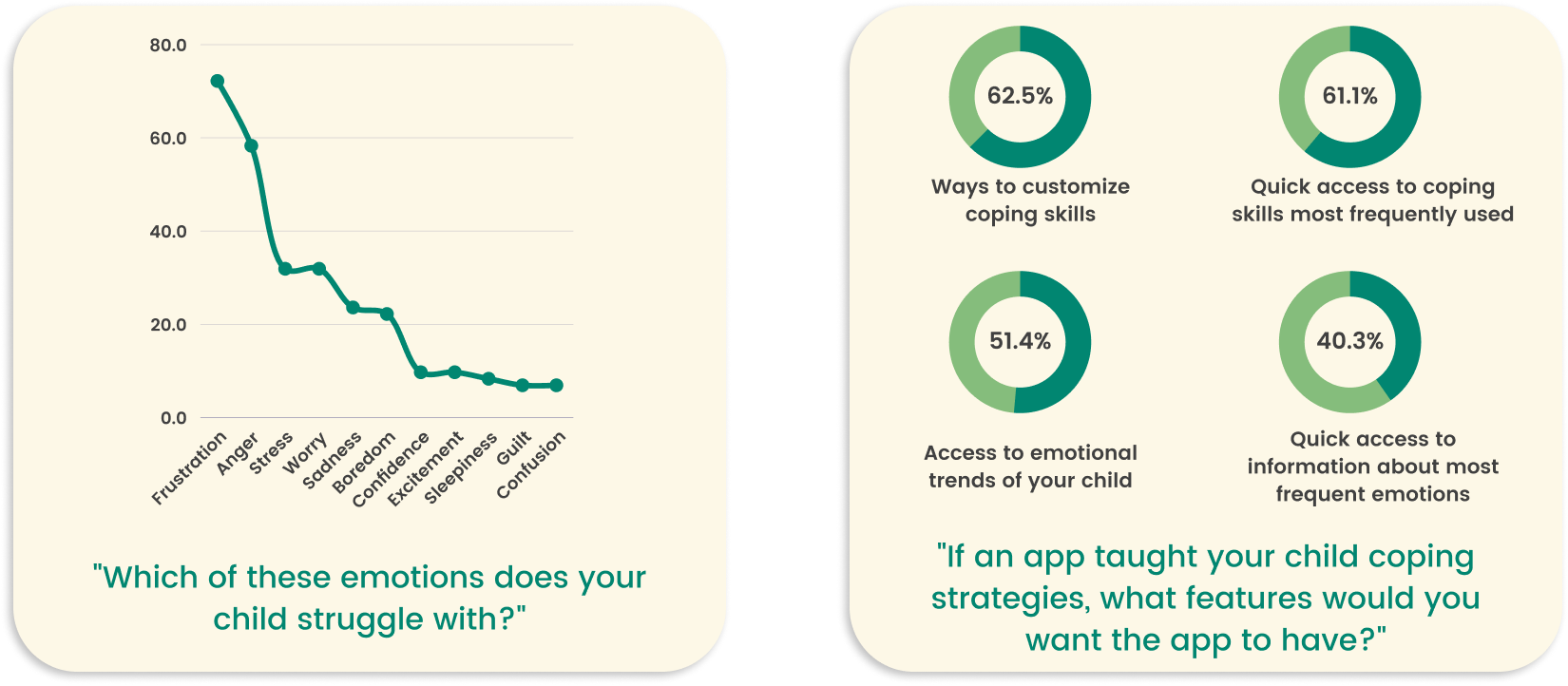
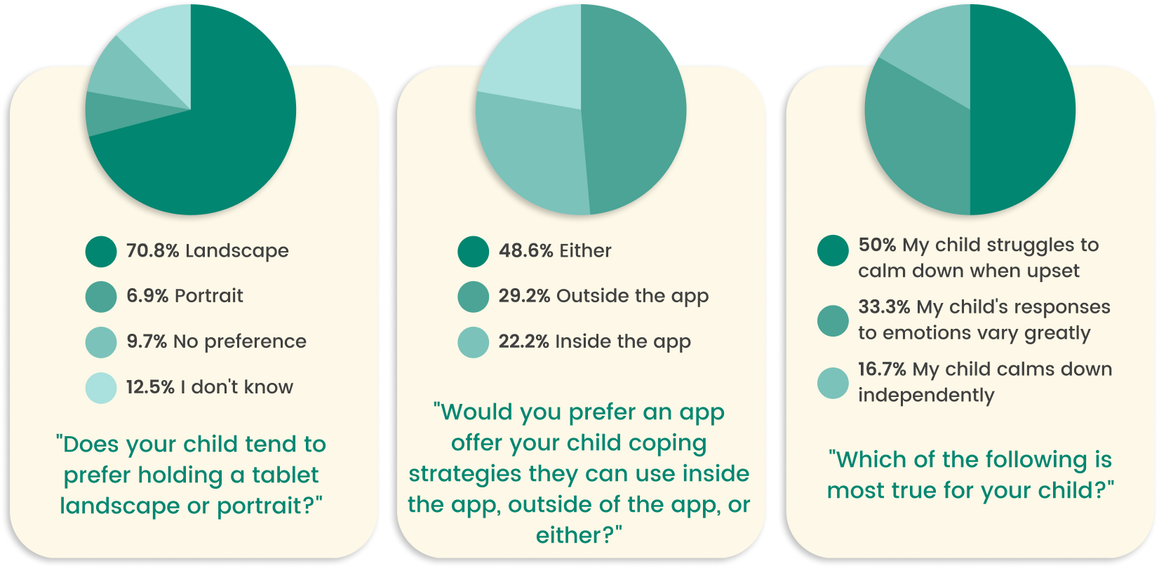
I began by exploring how families currently approach emotional regulation. I conducted surveys with 72 parents and interviews with 7 caregivers to understand common challenges, routines, and pain points.
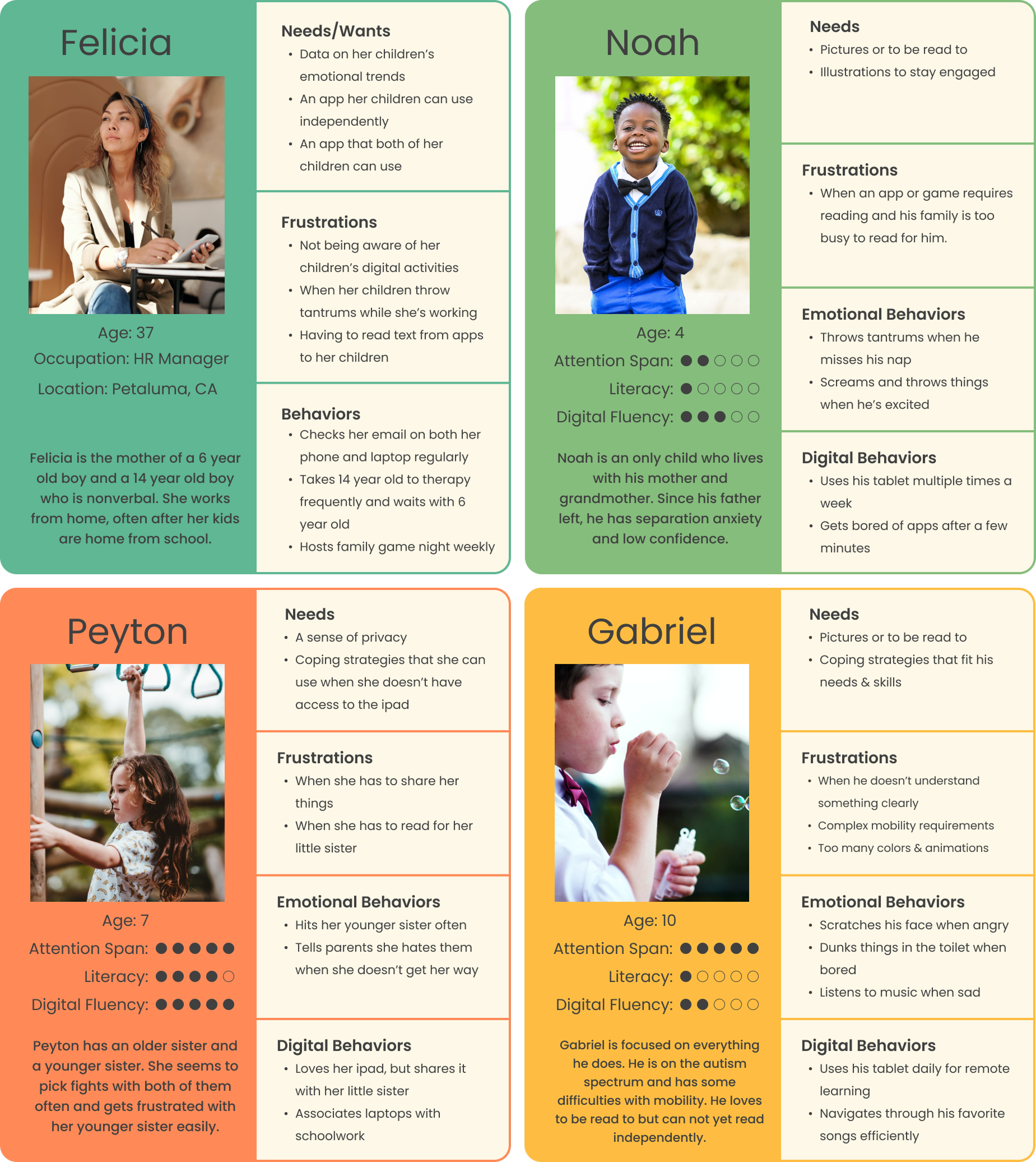
From this research, I developed four representative personas to guide design decisions:
These personas ensured the app’s tone, interactions, and accessibility features supported both children and caregivers in a shared emotional learning experience.
Based upon the information gathered above, I created 6 user stories - 3 for parent users and 3 for children users.
Early brainstorming explored two distinct user flows: one for children, focused on emotion check-ins and reflection activities, and one for parents, focused on insights and progress tracking.
Using affinity mapping, I prioritized features that met both user groups’ needs:
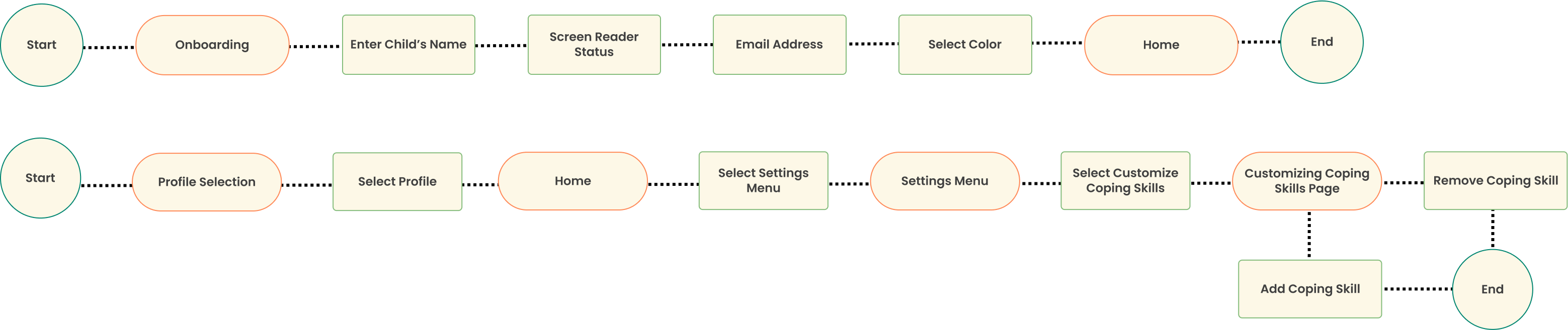
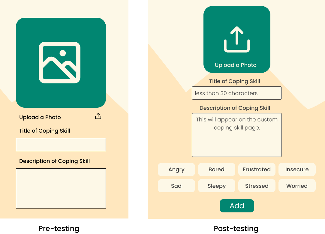
I created 4 user flows to satisfy the 6 user stories. For the parental side of things, I created an onboarding flow which addresses the screen reader function, access to emotional trends through email, and avatar selection which allows multiple children to use the app with separate profiles. Next I created a user flow for customizing coping skills.
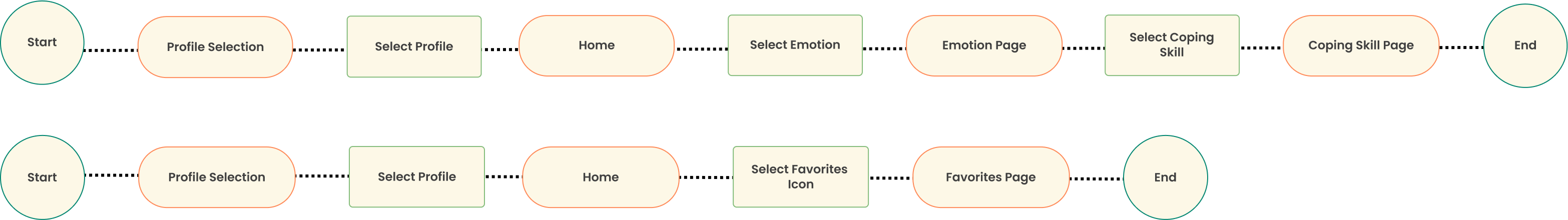
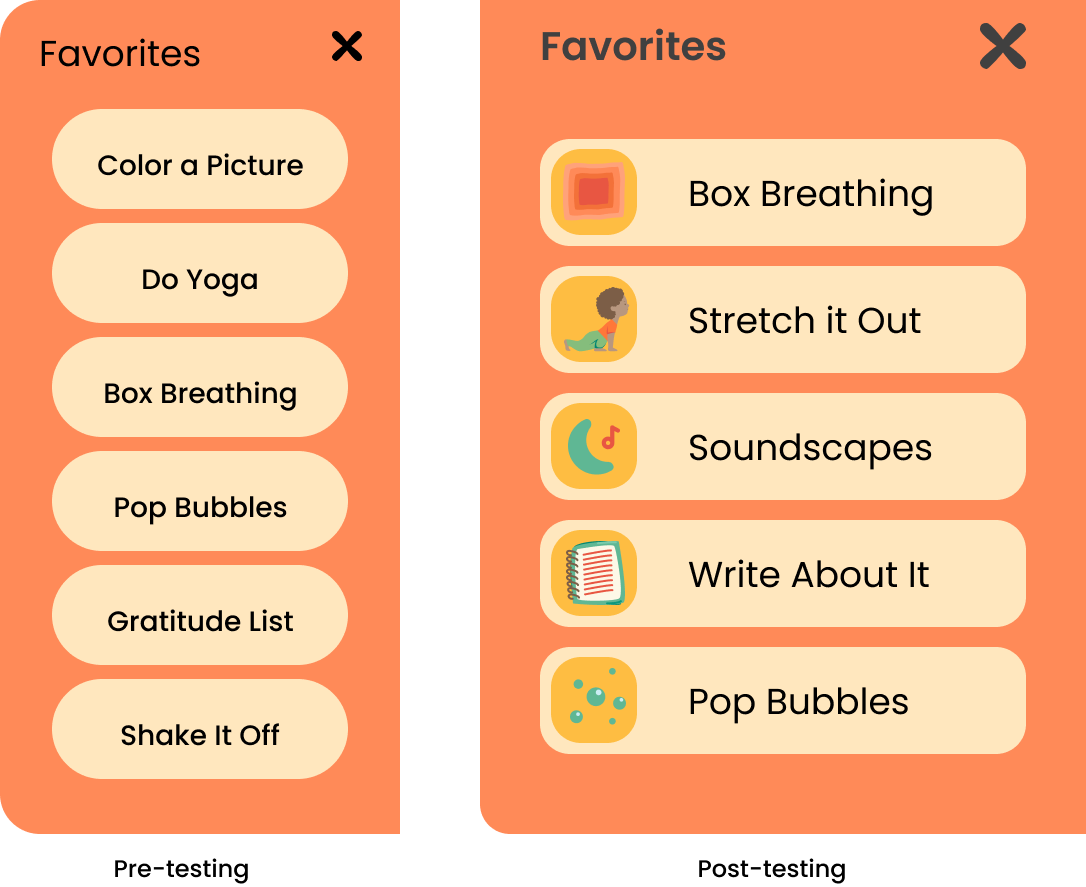
For the kids side of the app, I created a favorites flow in which user could access their favorite coping skills easily, and a coping skill flow which leads the users to a coping skill through the associated emotion page.
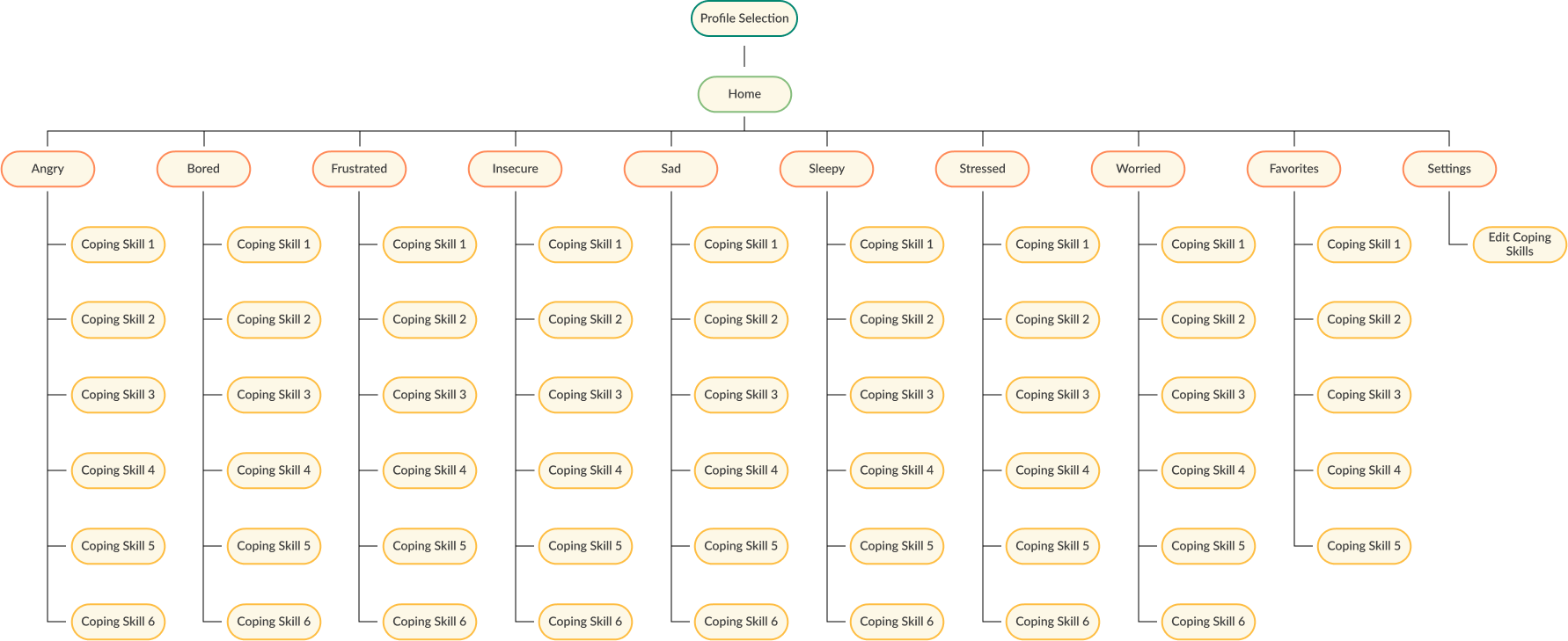
Utilizing the structures of these flows and the necessary additional pages to make these flows work, I created this site map.
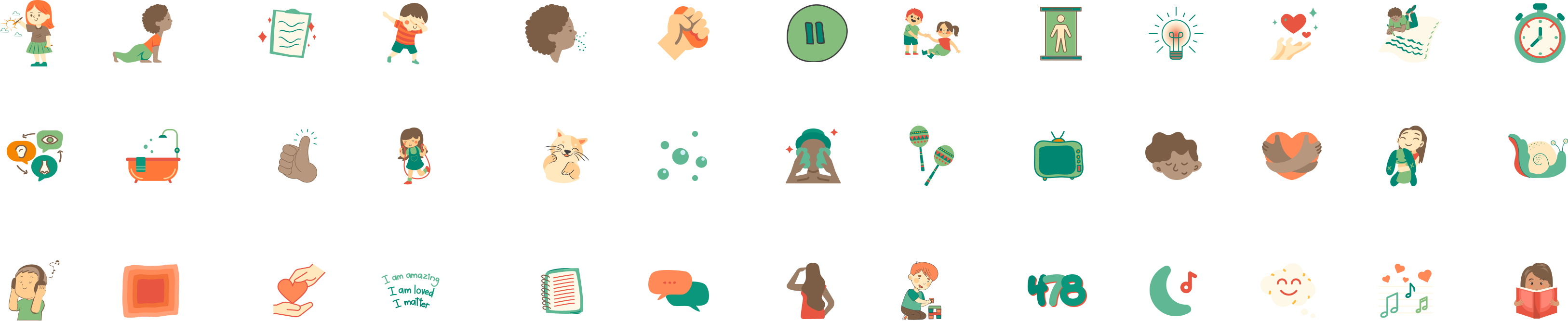
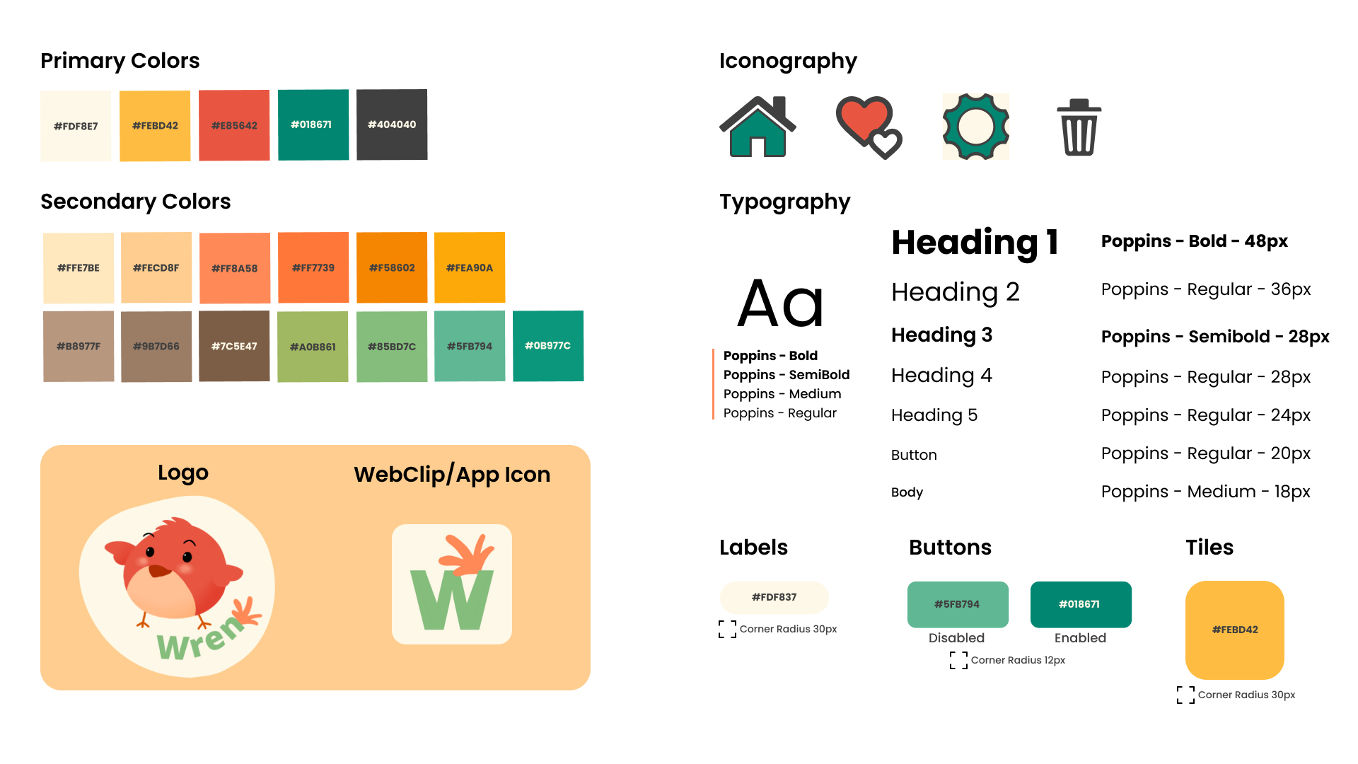
I collected graphics from Canva to represent each coping skill, eventually changing the colors of the images to fit with the color palette of the app (see Branding).
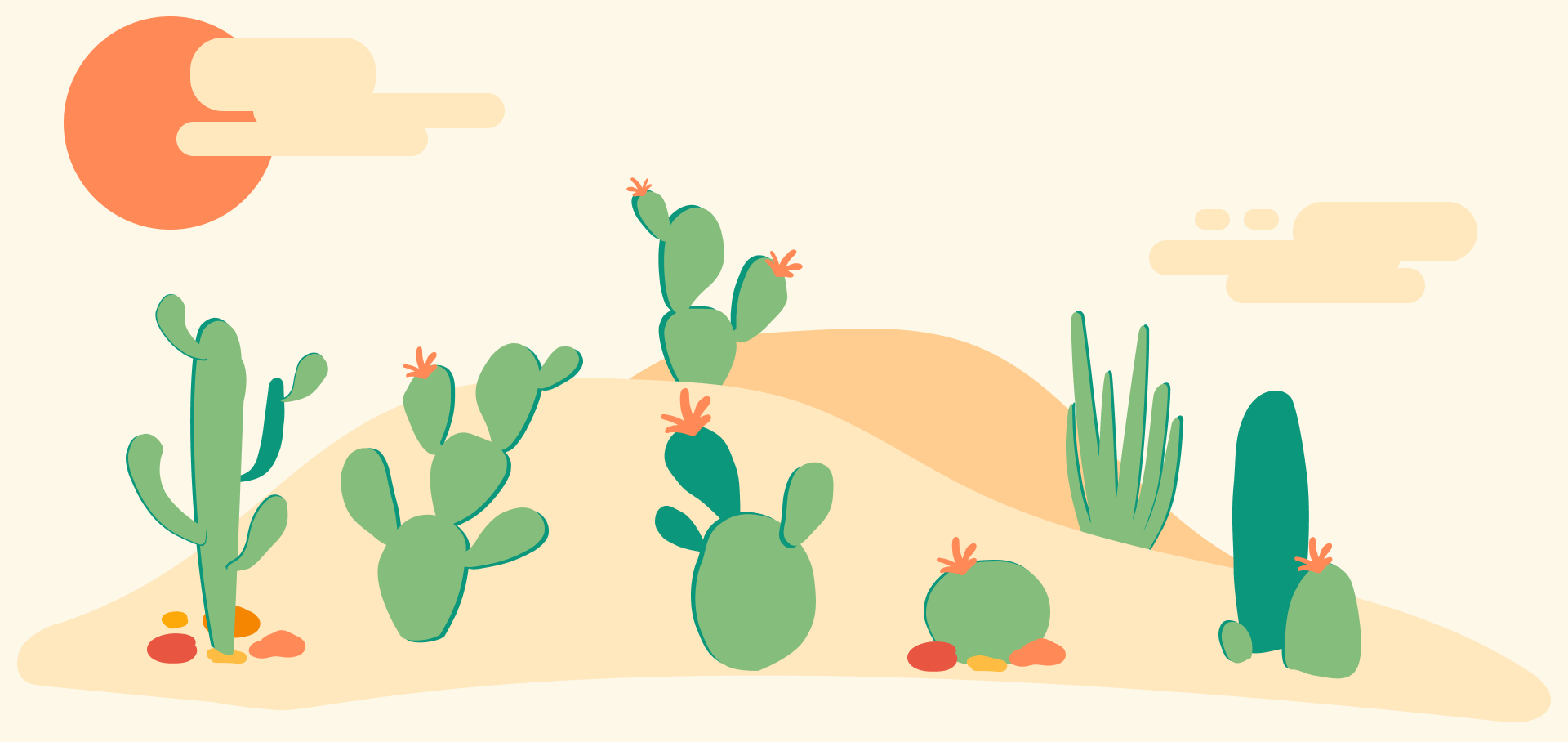
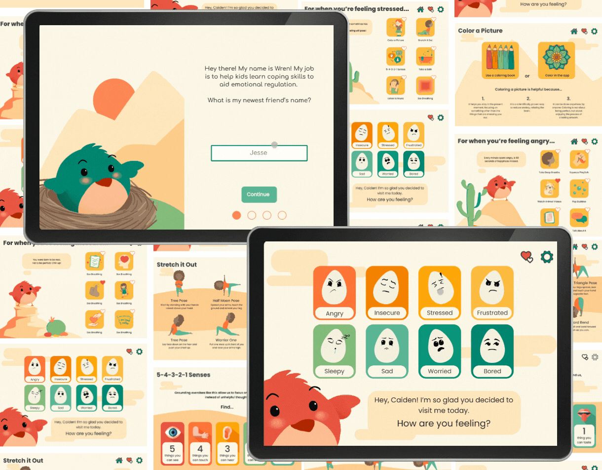
Using Figma, I created a collection of illustrations that were used across the app. Each emotion page features it's own unique cactus across a desert landscape.
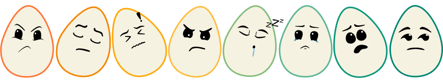
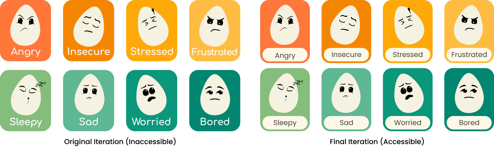
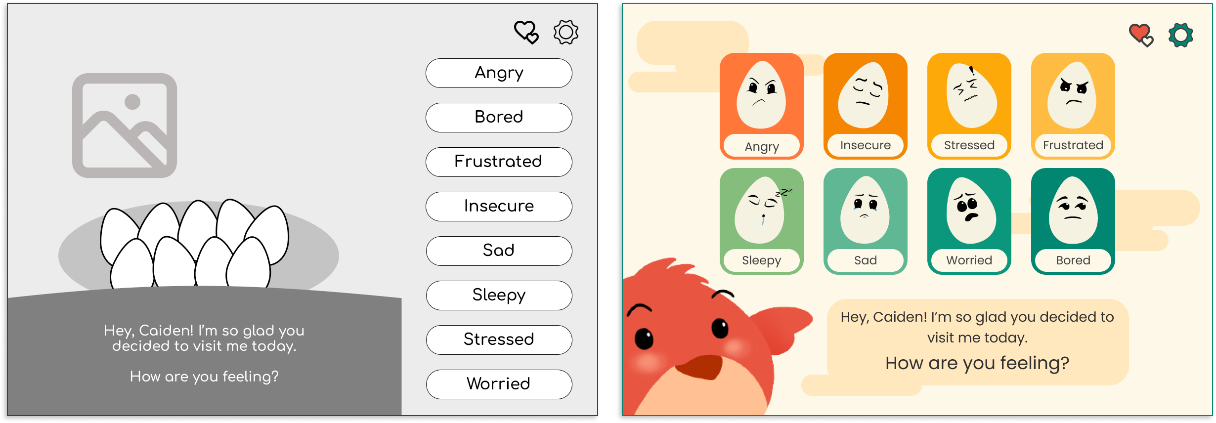
Lastly, I created the egg icons which would represent each emotion.
Before wireframing for this app, I decided...
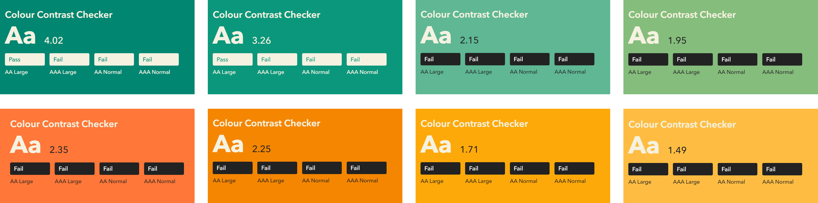
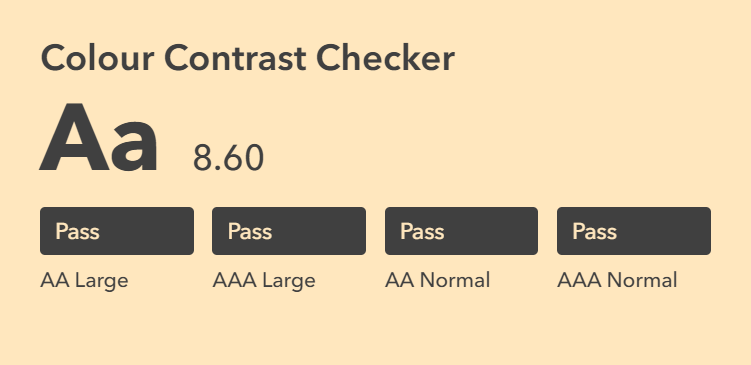
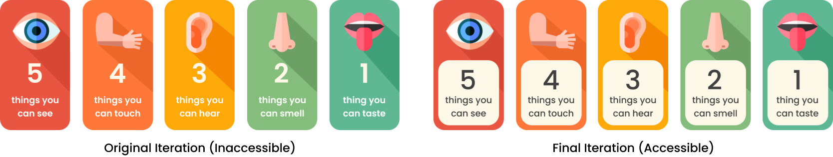
Color Contrast was considered throughout the project, maintaining WCAG 2.1 AAA accessibility standards.
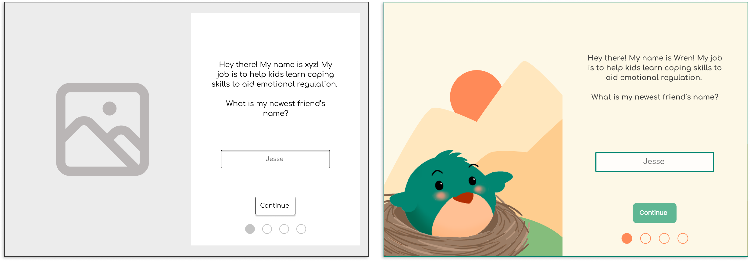
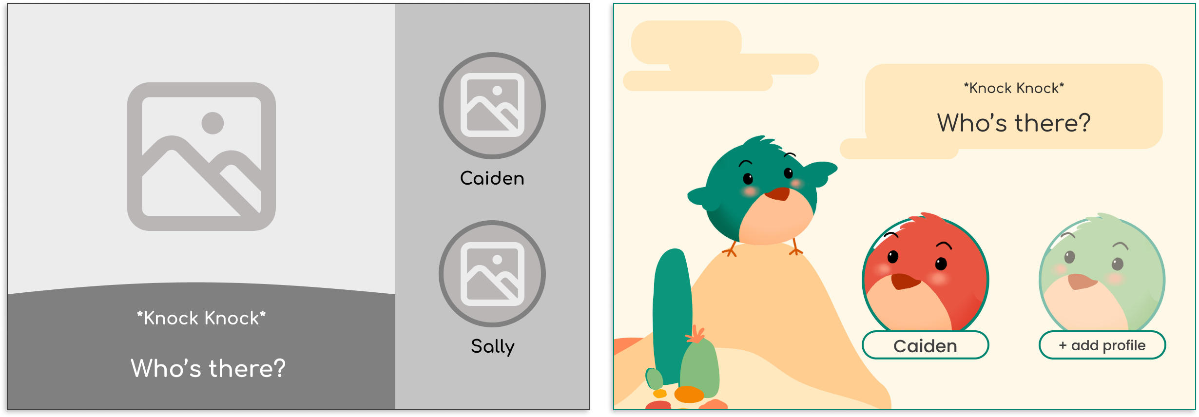
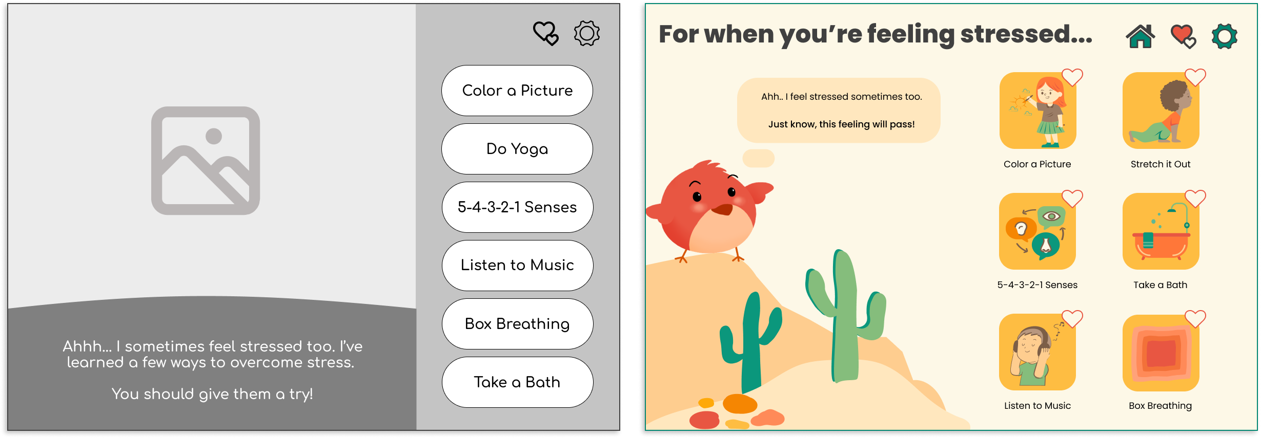
Wireframes were created in Figma and refined through feedback cycles with mentors. The design changed significantly from first wireframe to final design.
The final high-fidelity prototype emphasized clarity, calmness, and accessibility through:
Each screen was designed to feel like a breath - slow, intentional, and affirming.
Usability testing included 12 parents and 4 children completing three key tasks:
No usability blockers were identified, only refinements to pacing and microcopy.
Participants completed core flows without guidance.
All parents said they would use Wren regularly at home.
Parents said Wren could take the place of charts, posters, and calm-down corners.
Children were able to check in and start calming activities on their own.
Creating Wren required thinking beyond usability and into how an interface feels. I had to consider pacing, color, language, and animation as emotional cues. This taught me how to build experiences that support calm, trust, and reflection rather than just task completion.
As the sole designer, I led research, synthesis, prototyping, and usability testing myself. I learned how to define a problem space without existing structure and make confident decisions grounded in user insight, not guesswork or assumptions.
Designing for non-readers, neurodiverse users, and caregivers meant accessibility was the core of the solution. I learned how to use visual hierarchy, pacing, and interaction design to create experiences that are easy to understand, emotionally supportive, and flexible across different developmental levels.
Wren is a mobile app concept designed to help children ages 6–10 learn emotional regulation through reflection, visualization, and parent-guided activities. The goal was to give families a positive way to navigate tough emotions—encouraging kids to identify what they feel, understand why, and explore healthy coping strategies.
This project was my capstone for UX Design bootcamp. While it wasn’t created for a real company, I treated it like a live product—conducting real user research, defining goals, designing iteratively, and validating my ideas through usability testing with parents and children.
Designing for children required balancing engagement and simplicity while maintaining emotional sensitivity and accessibility. The challenge was to build an experience that was visually intuitive for kids, informative for parents, and calming for both.
With no pre-existing data or users, I had to create the entire foundation (research plans, survey instruments, personas, and usability protocol) from scratch.
I worked independently over eight weeks, completing every stage of the UX process: research, synthesis, wireframing, visual design, prototyping, and usability testing. This work was informed by my prior experience as a behavioral therapist supporting emotional learning for autistic children. Mentors provided critique checkpoints, but every decision was driven by my own research and validation.
Wren demonstrated my ability to take an abstract problem (emotional regulation) and translate it into a tangible, testable digital solution. The process strengthened my confidence in mixed-methods research, accessibility-first design, and aligning tone and visuals to emotional goals.
Using the SWOT method, I analyzed the strengths, weaknesses, opportunities, and threats of three products; Mood Flip Book; My Moods, My Choices; and Thought Spot.
I began by exploring how families currently approach emotional regulation. I conducted surveys with 72 parents and interviews with 7 caregivers to understand common challenges, routines, and pain points.
From this research, I developed four representative personas to guide design decisions:
These personas ensured the app’s tone, interactions, and accessibility features supported both children and caregivers in a shared emotional learning experience.
Based upon the information gathered above, I created 6 user stories - 3 for parent users and 3 for children users.
Early brainstorming explored two distinct user flows: one for children, focused on emotion check-ins and reflection activities, and one for parents, focused on insights and progress tracking.
Using affinity mapping, I prioritized features that met both user groups’ needs:
I created 4 user flows to satisfy the 6 user stories. For the parental side of things, I created an onboarding flow which addresses the screen reader function, access to emotional trends through email, and avatar selection which allows multiple children to use the app with separate profiles. Next I created a user flow for customizing coping skills.
For the kids side of the app, I created a favorites flow in which user could access their favorite coping skills easily, and a coping skill flow which leads the users to a coping skill through the associated emotion page.
Utilizing the structures of these flows and the necessary additional pages to make these flows work, I created this site map.
I collected graphics from Canva to represent each coping skill, eventually changing the colors of the images to fit with the color palette of the app (see Branding).
Using Figma, I created a collection of illustrations that were used across the app. Each emotion page features it's own unique cactus across a desert landscape.
Lastly, I created the egg icons which would represent each emotion.
Before wireframing for this app, I decided...
Color Contrast was considered throughout the project, maintaining WCAG 2.1 AAA accessibility standards.
Wireframes were created in Figma and refined through feedback cycles with mentors. The design changed significantly from first wireframe to final design.
The final high-fidelity prototype emphasized clarity, calmness, and accessibility through:
Each screen was designed to feel like a breath - slow, intentional, and affirming.
Usability testing included 12 parents and 4 children completing three key tasks:
No usability blockers were identified, only refinements to pacing and microcopy.
Participants completed core flows without guidance.
All parents said they would use Wren regularly at home.
Parents said Wren could take the place of charts, posters, and calm-down corners.
Children were able to check in and start calming activities on their own.
Creating Wren required thinking beyond usability and into how an interface feels. I had to consider pacing, color, language, and animation as emotional cues. This taught me how to build experiences that support calm, trust, and reflection rather than just task completion.
As the sole designer, I led research, synthesis, prototyping, and usability testing myself. I learned how to define a problem space without existing structure and make confident decisions grounded in user insight, not guesswork or assumptions.
Designing for non-readers, neurodiverse users, and caregivers meant accessibility was the core of the solution. I learned how to use visual hierarchy, pacing, and interaction design to create experiences that are easy to understand, emotionally supportive, and flexible across different developmental levels.
