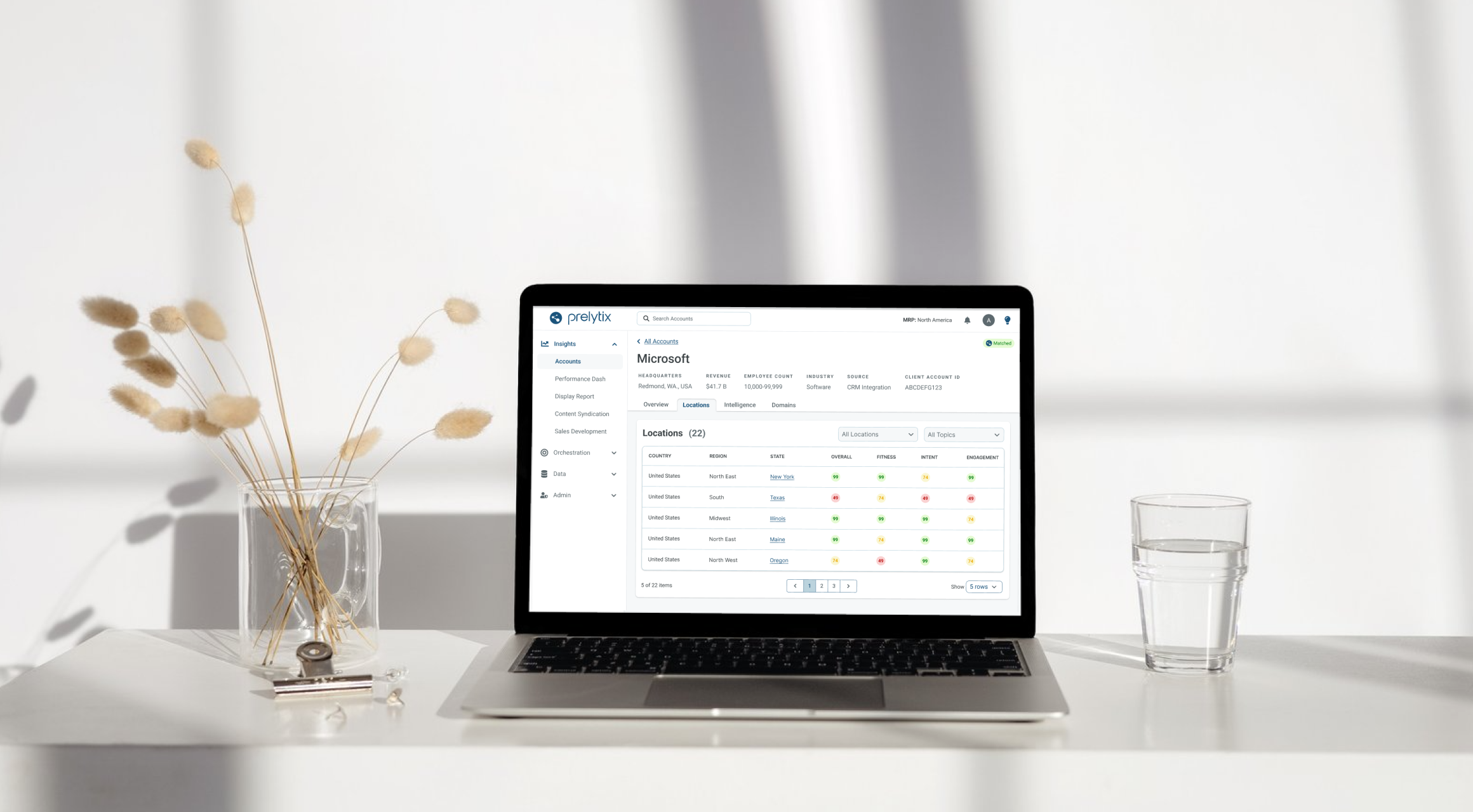
PharosIQ (formerly Market Resource Partners) is a B2B marketing technology company specializing in Account-Based Marketing (ABM). Their platform, Prelytix, helps global enterprises identify intent data, activate targeted campaigns, and measure ROI across complex buyer journeys.
As PharosIQ scaled from an internal service tool to a full SaaS product, Prelytix V1 struggled to meet the demands of both internal and external users. Campaign creation was spread across three separate workflows, lacked features like audience exclusions and pacing, and required extensive manual effort.
The business needed a streamlined, guided experience that simplified campaign creation while preserving the depth required by enterprise users.
I led design efforts across two cross-functional squads, each composed of one product manager and three engineers.
My responsibilities included:
The redesign reduced campaign creation time by 40%, unified three fragmented workflows into one, and improved accuracy and satisfaction across both internal and external users.
I began by gathering feedback from over 50 internal users through surveys and interviews, then joined sales demos to observe how prospective clients interacted with the tool. This revealed key friction points: repetitive data entry, disjointed navigation, and limited targeting control.
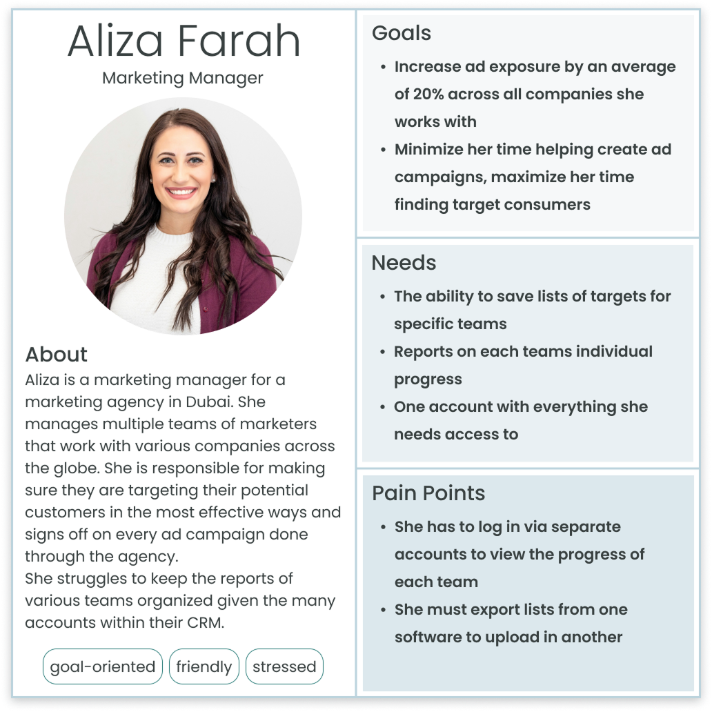
From this research, I developed three personas that shaped the redesign.
Based on the information collected, user stories were created to frame the problem around user needs and maintain an aligned vision across the teams.
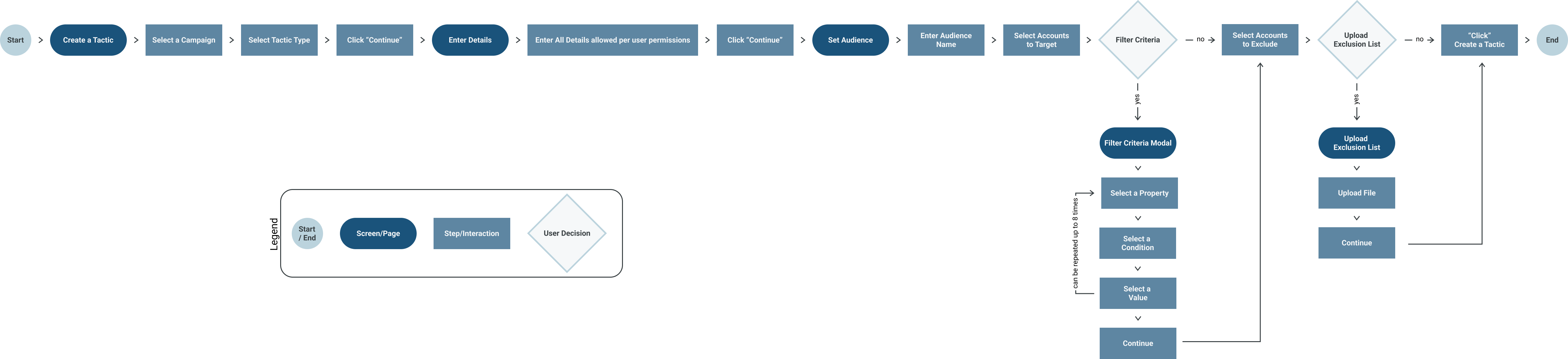
After identifying pain points around confusion and repetitive setup, I focused on simplifying the experience into a clear, guided flow. The goal was to reduce cognitive load without removing flexibility for advanced users.
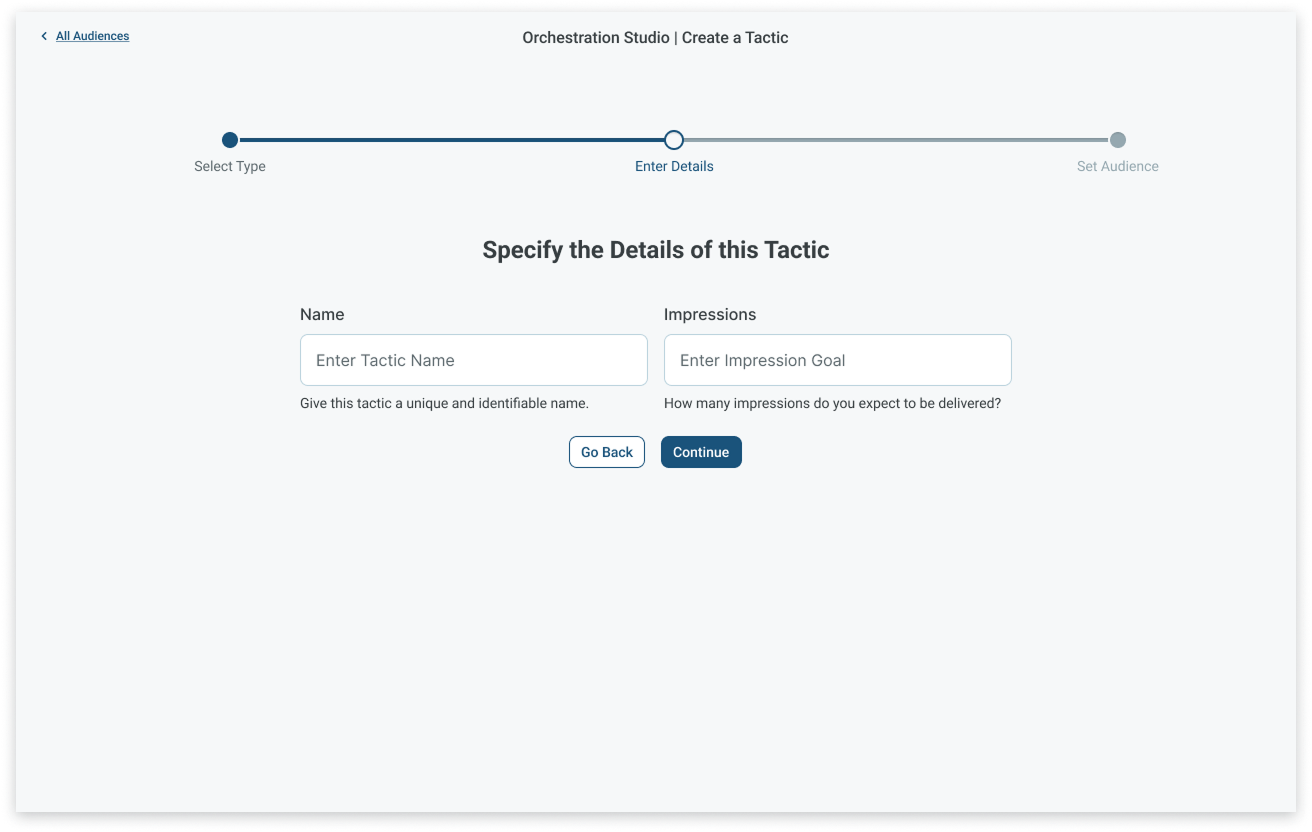
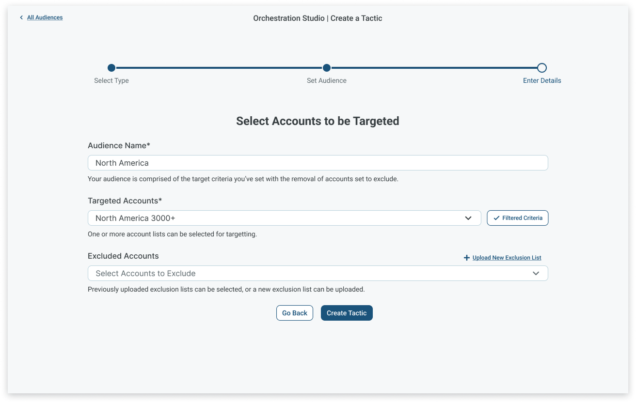
I restructured campaign creation into three intuitive stages that aligned with user expectations:
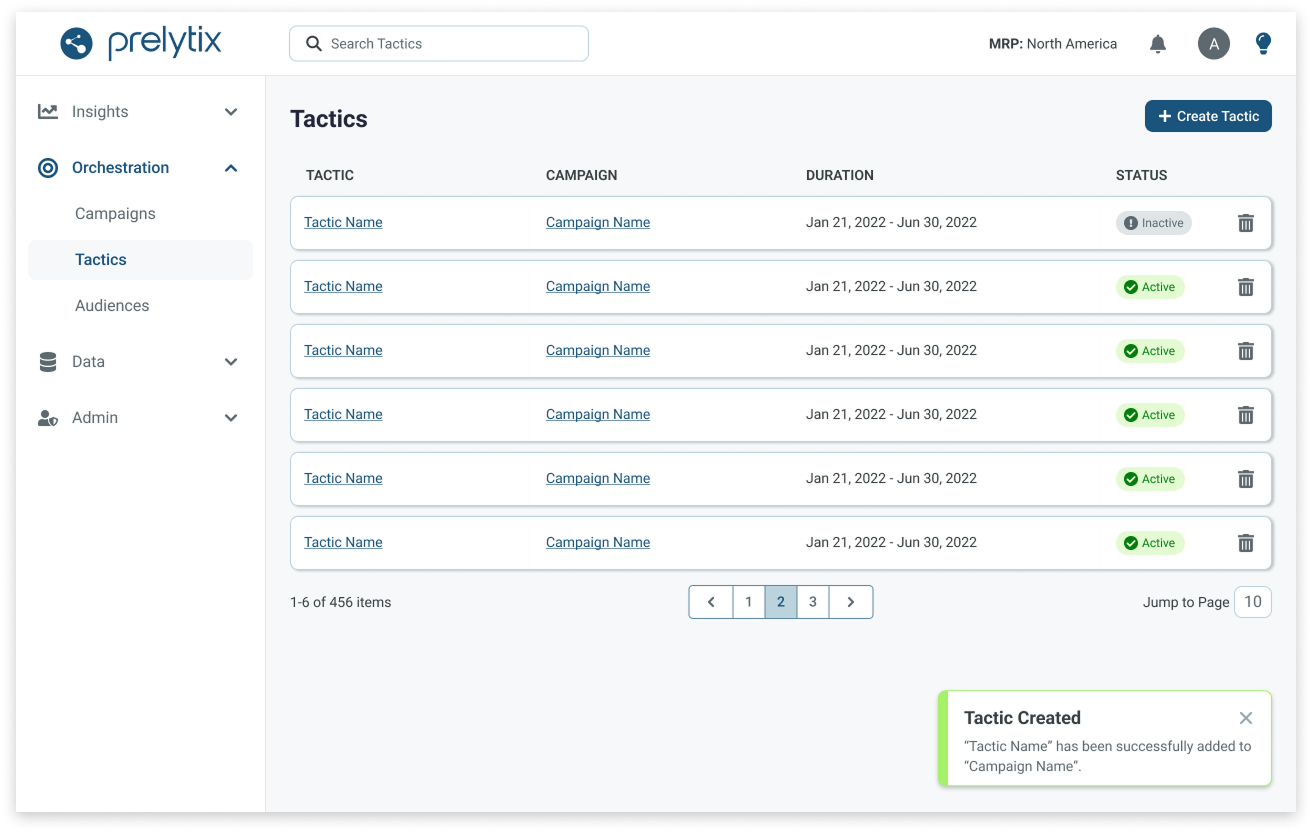
Each stage provided structure without friction, transforming a fragmented, three-part workflow into a single, cohesive experience that was faster, clearer, and easier to complete.
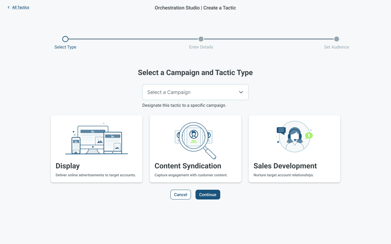
Once the core workflow was defined, I created high-fidelity prototypes in Figma using components from the PharosIQ design library. Each screen illustrated how users would move seamlessly through the three stages of campaign creation, from tactic selection to audience setup, with contextual guidance and validation built in.
The prototype emphasized clarity and hierarchy, replacing dense forms with progressive disclosure and consistent visual cues. This approach made it easier for users to stay oriented, understand dependencies, and complete campaigns in a single, uninterrupted flow.
I conducted two rounds of usability testing with four internal power users who were deeply familiar with the legacy system.
Round 1 confirmed that the new structure was faster and more intuitive, but surfaced missing functionality like audience exclusions and pacing controls.
Round 2 showed complete alignment between user needs and the new design. All testers agreed that the updated experience would optimize their workflow, offering the same outcomes as before, but now with greater control, fewer steps, and improved accuracy.
Unified three fragmented workflows into one streamlined process.
Enhanced clarity and reduced setup errors for both internal and external users.
Delivered high-impact updates like audience exclusions and pacing controls.
This project became a cornerstone for Prelytix V2, establishing a scalable framework that guided future feature development and strengthened PharosIQ’s transition from internal tool to enterprise-grade SaaS platform.
Working within a highly technical enterprise platform pushed me to simplify without oversimplifying. Turning three disconnected workflows into one guided process taught me how to distill complex business logic into an experience that feels intuitive and approachable for any user.
Running surveys and two rounds of usability testing reinforced how essential real feedback is to shaping product direction. Hearing directly from users revealed gaps we couldn't see from within the team and those insights led to meaningful improvements like pacing controls, audience exclusions, and a more cohesive flow.
This project expanded my perspective beyond immediate design deliverables. By designing for scalability (reusable components, consistent logic, and clear hierarchy) I learned to build experiences that can grow with the product rather than be replaced by the next release.
PharosIQ (formerly Market Resource Partners) is a B2B marketing technology company specializing in Account-Based Marketing (ABM). Their platform, Prelytix, helps global enterprises identify intent data, activate targeted campaigns, and measure ROI across complex buyer journeys.
As PharosIQ scaled from an internal service tool to a full SaaS product, Prelytix V1 struggled to meet the demands of both internal and external users. Campaign creation was spread across three separate workflows, lacked features like audience exclusions and pacing, and required extensive manual effort.
The business needed a streamlined, guided experience that simplified campaign creation while preserving the depth required by enterprise users.
I led design efforts across two cross-functional squads, each composed of one product manager and three engineers.
My responsibilities included:
The redesign reduced campaign creation time by 40%, unified three fragmented workflows into one, and improved accuracy and satisfaction across both internal and external users.
I began by gathering feedback from over 50 internal users through surveys and interviews, then joined sales demos to observe how prospective clients interacted with the tool. This revealed key friction points: repetitive data entry, disjointed navigation, and limited targeting control.
From this research, I developed three personas that shaped the redesign.
Based on the information collected, user stories were created to frame the problem around user needs and maintain an aligned vision across the teams.
After identifying pain points around confusion and repetitive setup, I focused on simplifying the experience into a clear, guided flow. The goal was to reduce cognitive load without removing flexibility for advanced users.
I restructured campaign creation into three intuitive stages that aligned with user expectations:
Each stage provided structure without friction, transforming a fragmented, three-part workflow into a single, cohesive experience that was faster, clearer, and easier to complete.
Once the core workflow was defined, I created high-fidelity prototypes in Figma using components from the PharosIQ design library. Each screen illustrated how users would move seamlessly through the three stages of campaign creation, from tactic selection to audience setup, with contextual guidance and validation built in.
The prototype emphasized clarity and hierarchy, replacing dense forms with progressive disclosure and consistent visual cues. This approach made it easier for users to stay oriented, understand dependencies, and complete campaigns in a single, uninterrupted flow.
I conducted two rounds of usability testing with four internal power users who were deeply familiar with the legacy system.
Round 1 confirmed that the new structure was faster and more intuitive, but surfaced missing functionality like audience exclusions and pacing controls.
Round 2 showed complete alignment between user needs and the new design. All testers agreed that the updated experience would optimize their workflow, offering the same outcomes as before, but now with greater control, fewer steps, and improved accuracy.
Unified three fragmented workflows into one streamlined process.
Enhanced clarity and reduced setup errors for both internal and external users.
Delivered high-impact updates like audience exclusions and pacing controls.
This project became a cornerstone for Prelytix V2, establishing a scalable framework that guided future feature development and strengthened PharosIQ’s transition from internal tool to enterprise-grade SaaS platform.
Working within a highly technical enterprise platform pushed me to simplify without oversimplifying. Turning three disconnected workflows into one guided process taught me how to distill complex business logic into an experience that feels intuitive and approachable for any user.
Running surveys and two rounds of usability testing reinforced how essential real feedback is to shaping product direction. Hearing directly from users revealed gaps we couldn't see from within the team and those insights led to meaningful improvements like pacing controls, audience exclusions, and a more cohesive flow.
This project expanded my perspective beyond immediate design deliverables. By designing for scalability (reusable components, consistent logic, and clear hierarchy) I learned to build experiences that can grow with the product rather than be replaced by the next release.
